Design
Main > Design
Portfolio Website
ポートフォリオサイト
Portfolio Website of Sara Tanaka
2024
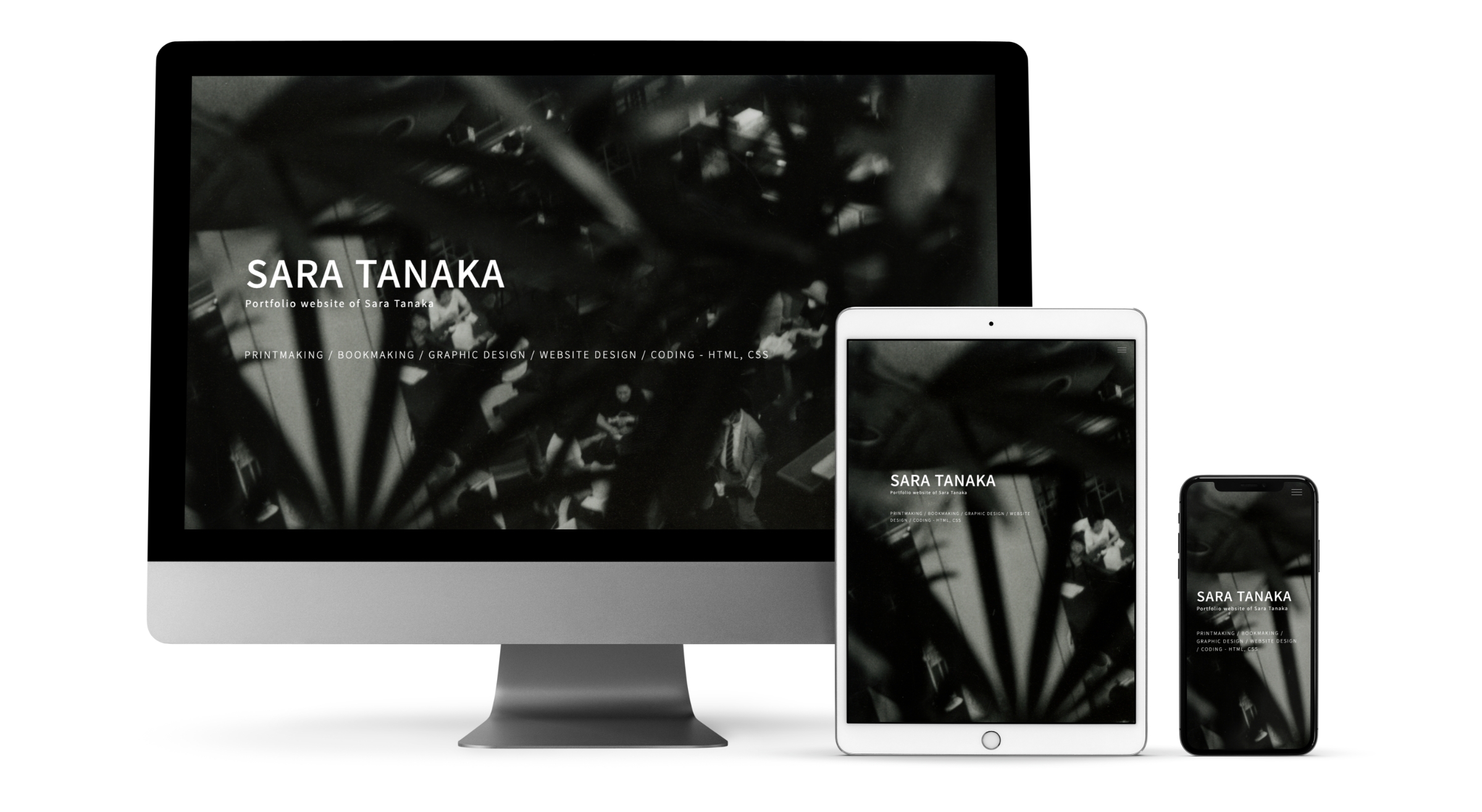
Design, Coding ( HTML/CSS/Javascript )
Tools: Photoshop, XD, VisualStudioCord
1week
以前製作した紙媒体を想定したポートフォリオを元にこれまでの作品をまとめたWebポートフォリオを製作しました。
I created this web portfolio of my past works based on the design of the portfolio for paper media I created last year.
制作プロセス
Design Process

Adobe XDでデザインの制作編集、プロトタイプ制作を行いました。
Design editing and prototyping were done in Adobe XD.
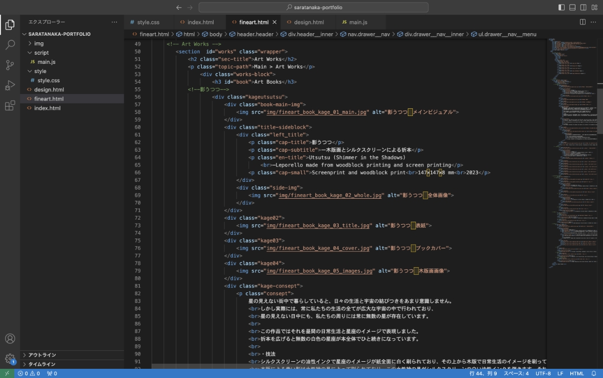
HTML/CSS/Jvascriptでコーディングを行いました。
Coded in HTML/CSS/Jvascript.
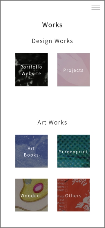
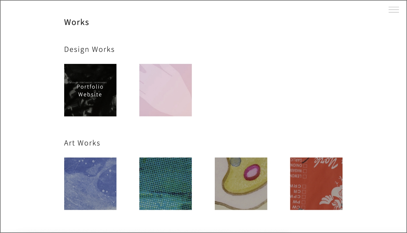
デザイン作品と美術作品の2つに大きく分類しページを分けました。自分の作品を知らない人に向け、まずは手軽に色々な作品を包括的に見ていただけるよう、ページは分割しすぎず、最初に選択したカテゴリーを見終えた後にそのまま同じページで次のカテゴリーを閲覧できるデザインにしました。
I divided the pages into two main categories: design works and fine art works. For those who are unfamiliar with my work, I designed the pages not to be too divided so that they can comprehensively view a variety of works, and after viewing the first selected category, they can continue browsing the next category on the page.


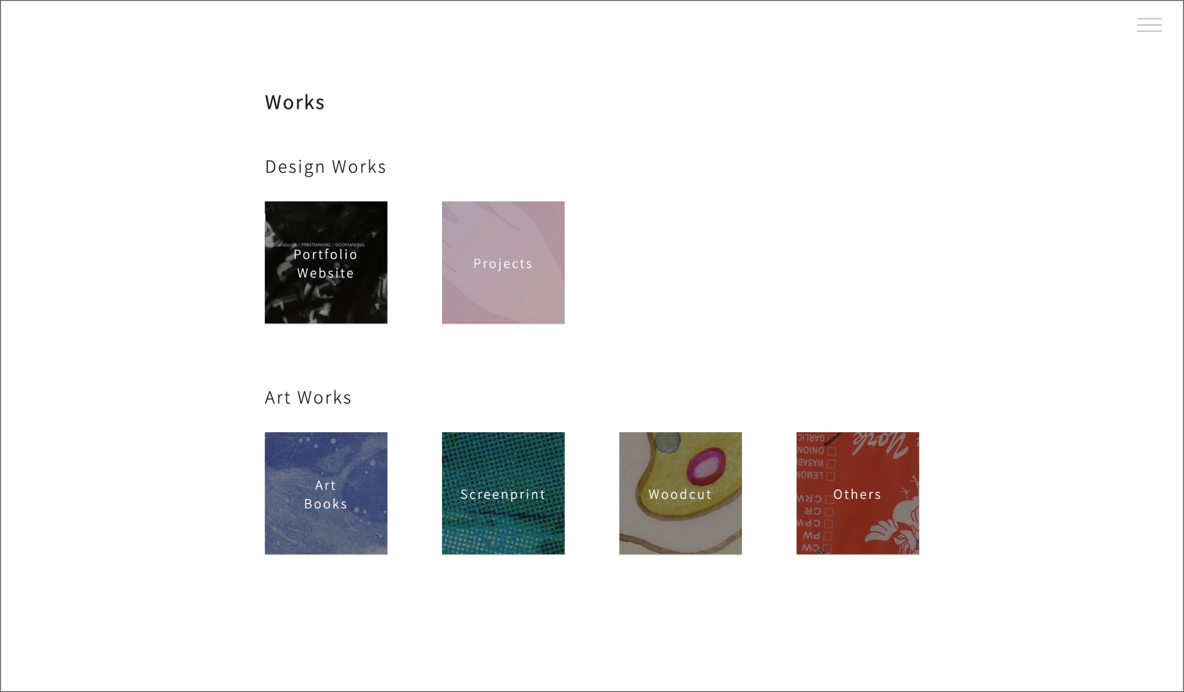
デザイン作品については2つ、美術作品については4つのカテゴリ分けをし、トップページからリンク先のページの各技法の箇所に直接アクセスできるようにしました。
I divided design works into two categories and art works into four categories, and made it possible to access each category section of the linked pages directly from the top page.
日英表記
日英表記にし、なるべく多くの人が理解できるポートフォリオを目指しました。
Bilingual Website
By writing in both Japanese and English, I aimed to make the portfolio accessible to as many people as possible.
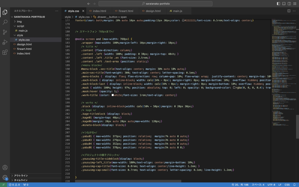
レスポンシブデザイン
CSSのFlexboxを使い、PCやタブレットでは横並びとなっているテキストや画像などをスマートフォンでは縦並びで表示するようにしました。
Responsive Web Design
Using CSS Flexbox, text and images that are aligned horizontally on PCs and tablets are displayed vertically on smartphones.

PCではトップページのメニュー上のカテゴリ名をホバーされた時のみに表示し、スマートフォンやタブレットなどのタッチデバイスではカテゴリ名を常時表示するようにしました。
On PCs, category names in the menu block are displayed when hovered over, but on touch devices such as smartphones and tablets, category names are always displayed.

その他細かい要素についても調整し、どのデバイスでも見やすく整った表示になるようデザインしました。
Other minor elements were also adjusted to ensure that the design would be well organized on all devices.


Projects
令和3年度 京都府
学生×地域つながる未来プロジェクト
Kyoto Prefecture’s Students x Community Connecting Futures Project
2021 - 2022
2021年9月から2022年3月まで、京都府の「学生×地域つながる未来プロジェクト」に参加しました。これは大学生がNPOやボランティア団体などの地域の活動団体とチームとなり、地域活動に取り組むプロジェクトです。
From September 2021 to March 2022, I took part in the Kyoto Prefecture's "Students x Community Connecting Futures Project". This is a project in which university students work together with community action groups (NPOs, volunteer organisations, etc) as a team to engage in community activities.
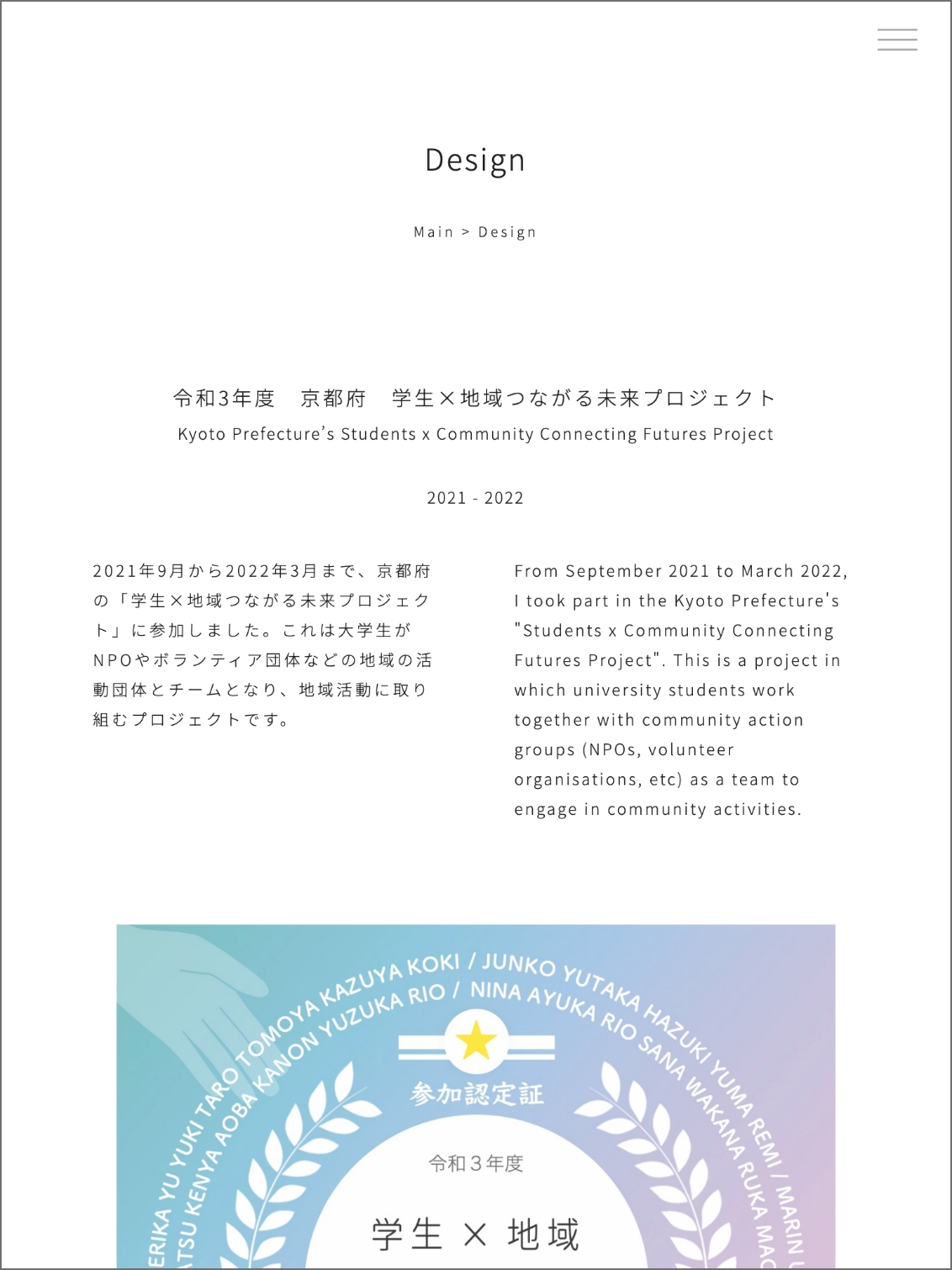
1. プロジェクト
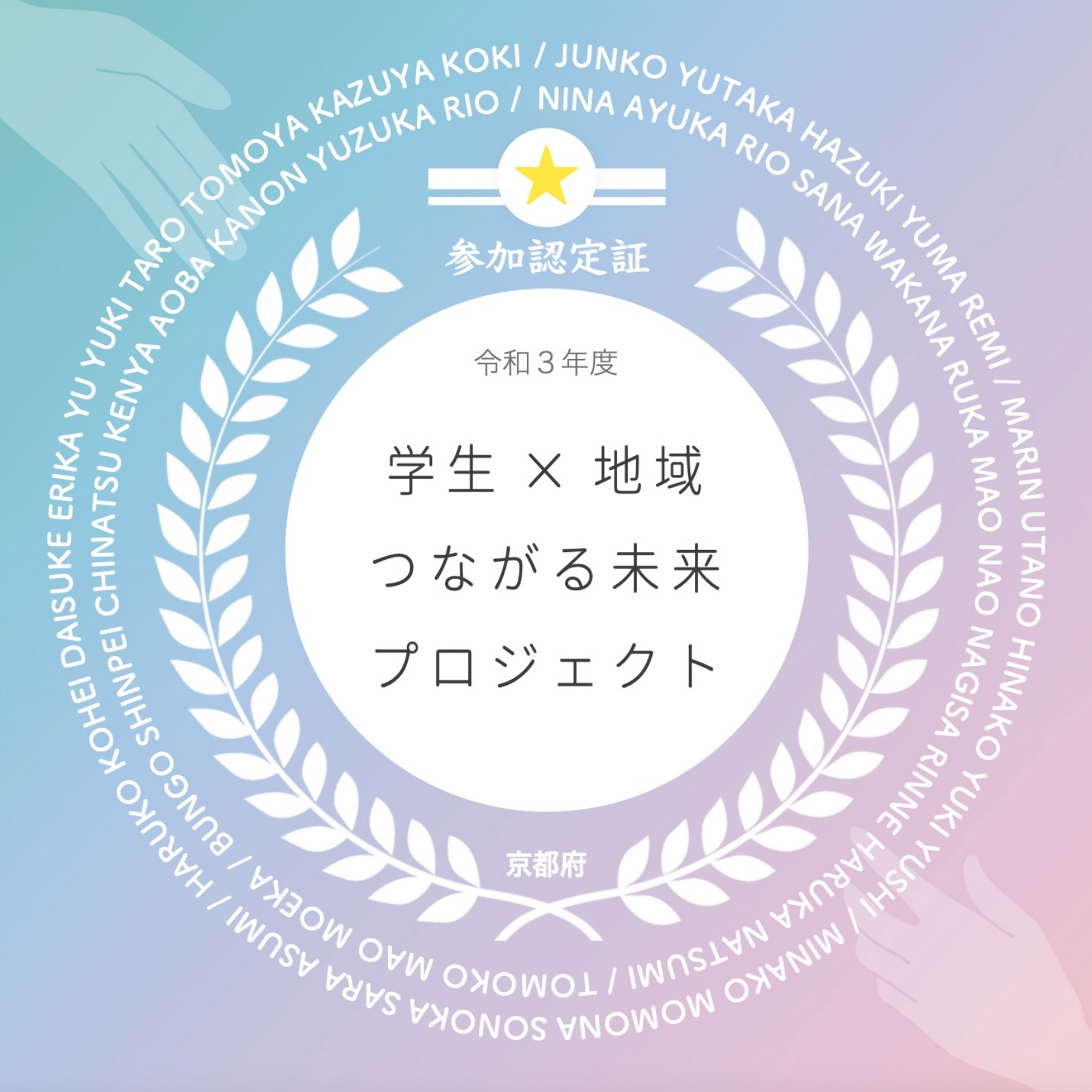
参加認定証ステッカー
Participation Certificate Sticker
2022
Editing Tools :
Illustrator, Photoshop, Clip Studio
プロジェクトに参加した人全員に発行する参加認定証ステッカーをデザインしました。
designed the participation certificate stickers issued to those who participated in the project.
制作意図
①「頑張った証」となり、参加者が認定されたと感じられるデザインを目指しました。
②デザインを依頼していただいた京都府の担当者の方から、集合写真のような思い出になるものにするため、参加者全員の名前を入れるというリクエストがありました。
Aim of the Design
The first aim is to make it memorable, like a group photo, and for this reason the coordinator asked me to include the names of all the participants.
The second aim is to make it a testimony of hard work and to design it in such a way that the participants feel recognised.
前年度のデザインからの改善点
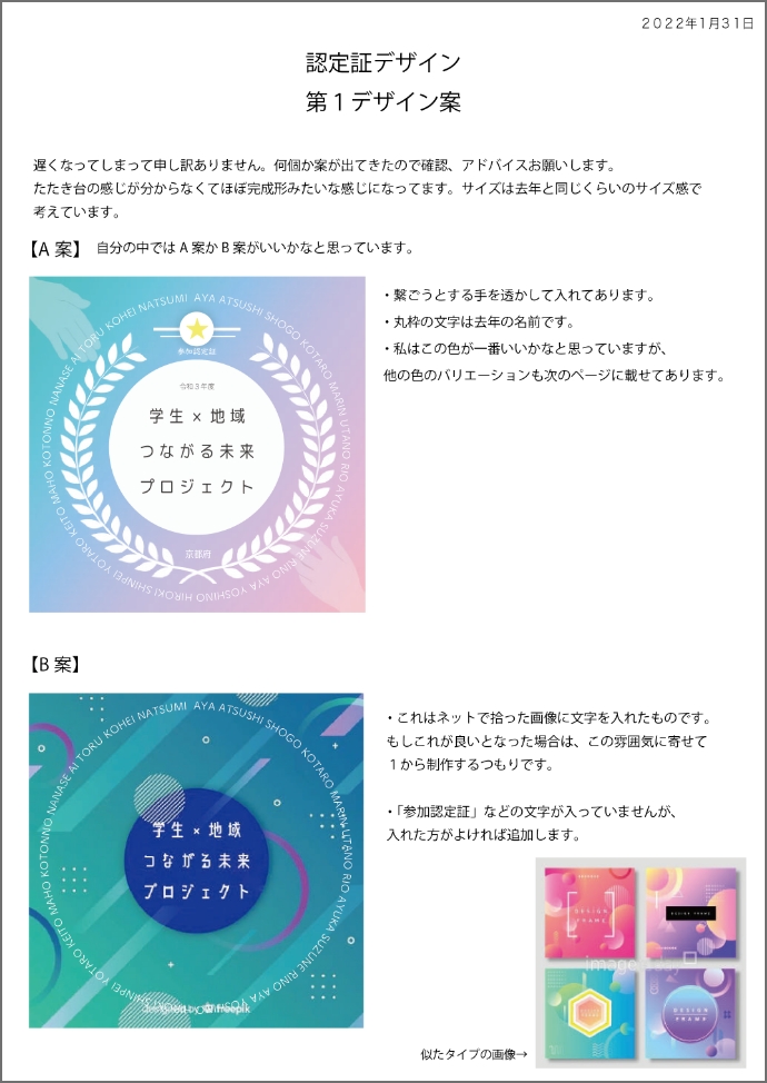
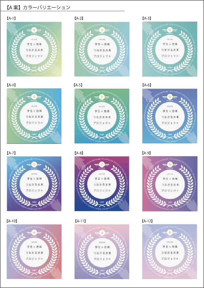
ステッカーは府庁のプリンターでA4サイズのシール台紙に印刷されますが、前年度のステッカーは円形で、ハサミで1枚1枚丸く切り取って作っていたとのことでした。
今回は50人程に配るため、簡単に切り分けられるよう正方形のデザインにしました。
Points for Improvement
The stickers are printed on an A4 sticker base, but previous year's stickers were round and had to be cut out one by one with scissors. So this year, as they will be issued to about 50 people, I made them square so that they are easy to cut into pieces.
デザインのポイント
地域団体と大学生という、異なる主体を表す2つの手のある箇所の背景はそれぞれ違う色ですが、両者の間には線が引かれているわけではなく、緩やかにグラデーションになっています。それぞれが互いに手を差し伸ばそうとする様子によって、学生×地域つながる未来プロジェクトの「協働」というコンセプトを表現しました。
Key Design Points
Illustration of two hands representing different actors - a community organization and a university student - each in a different color, but with no line drawn between them, but rather a gradation, representing the concept of 'collaboration' in this project by the way they try to reach out to each other.

プロセス
デザインの依頼を受けた後、いくつか異なる雰囲気のデザインを提案し、カラーバリエーションなども検討しながら府庁の担当者の方と相談してデザインを決定しました。
決定後、細かな修正を数回重ねたのちに実際のシール台紙にプリントしたものを郵送していただき、実際の色味等を見ながら最終的な印刷データを完成させました。
Draft Proposal
After receiving a request to create a sticker design, I proposed several different atmospheres in addition to the main design. I decided on the design after consulting with the coordinator while also considering color variations.
After several revisions, I asked the coordinator to send me a printout of the design on the sticker base, and I completed the final design data while observing the actual colors.
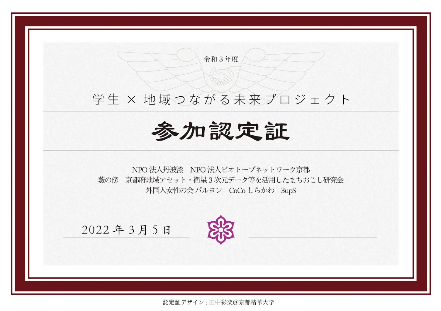
2. プロジェクト参加認定証(賞状)
Certificate of Participation
2022
Editing Tools : Illustrator
担当者の方に、提案した中のもう一つのステッカーデザイン案について、「賞状のようでこのデザインも良い。紙に印刷してステッカーと併せて送付してはどうか。」と提案していただき、ステッカーだけでなく賞状デザインの認定証も発行することになりました。
The coordinator liked the other design in the draft proposal as well, so it was decided to make and issue a certificate of participation with an award design as well as a sticker.
3. インスタグラムの運営/
投稿デザイン
Instagram Management
2021
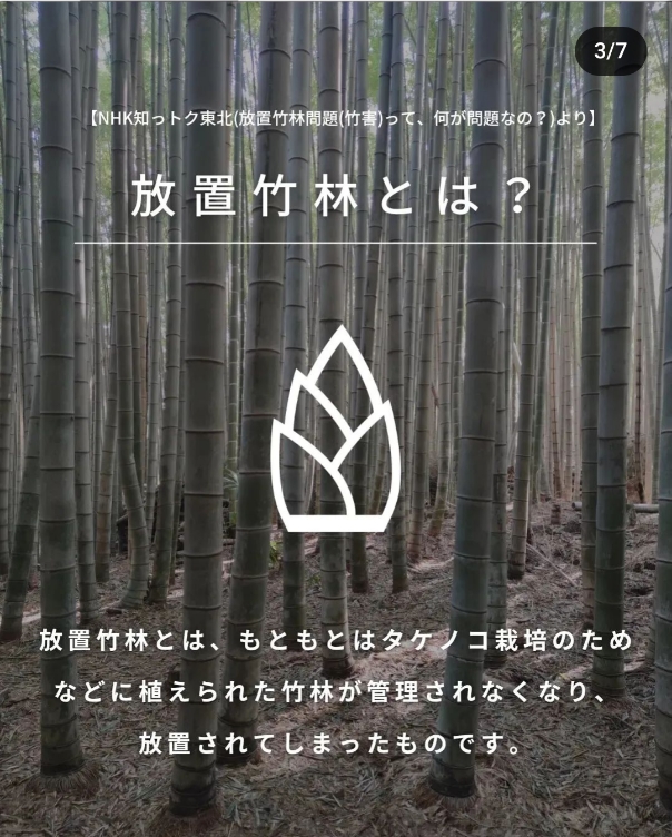
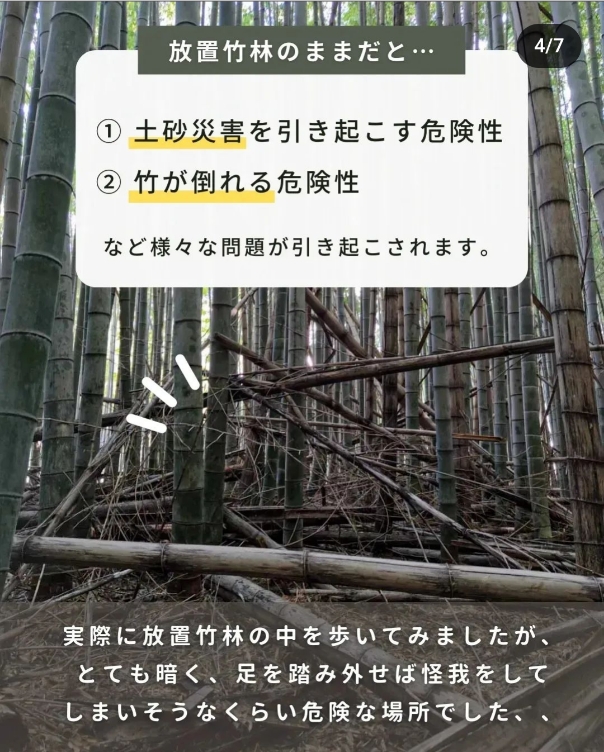
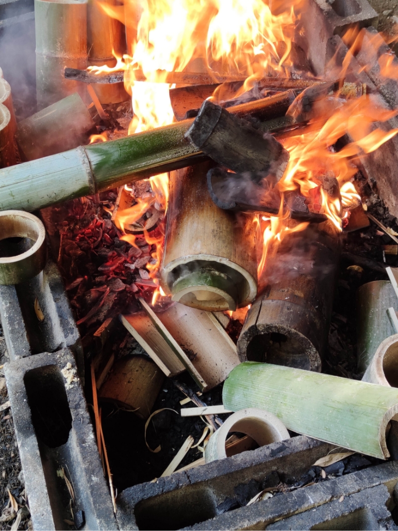
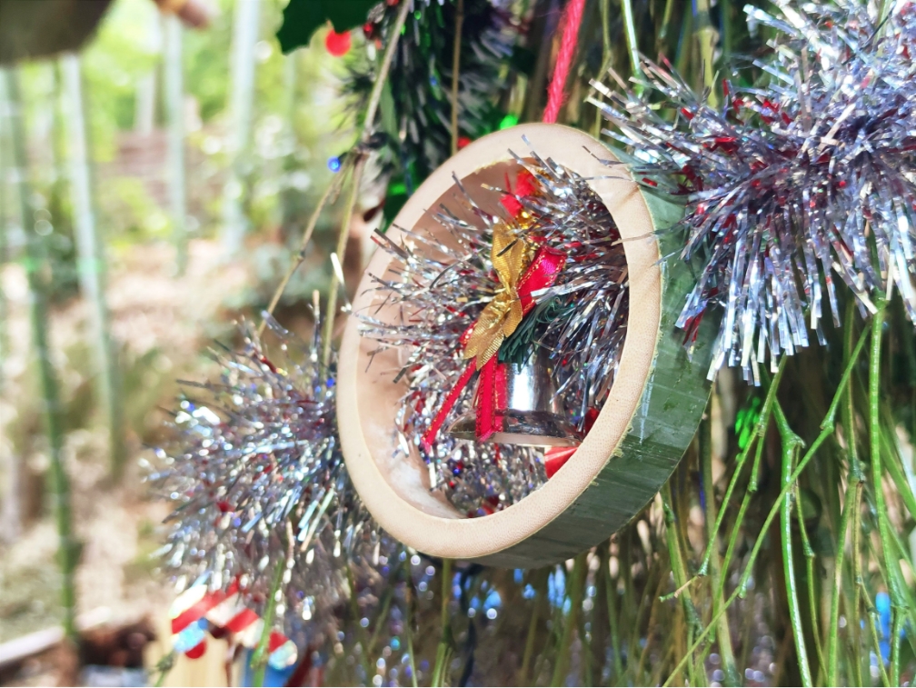
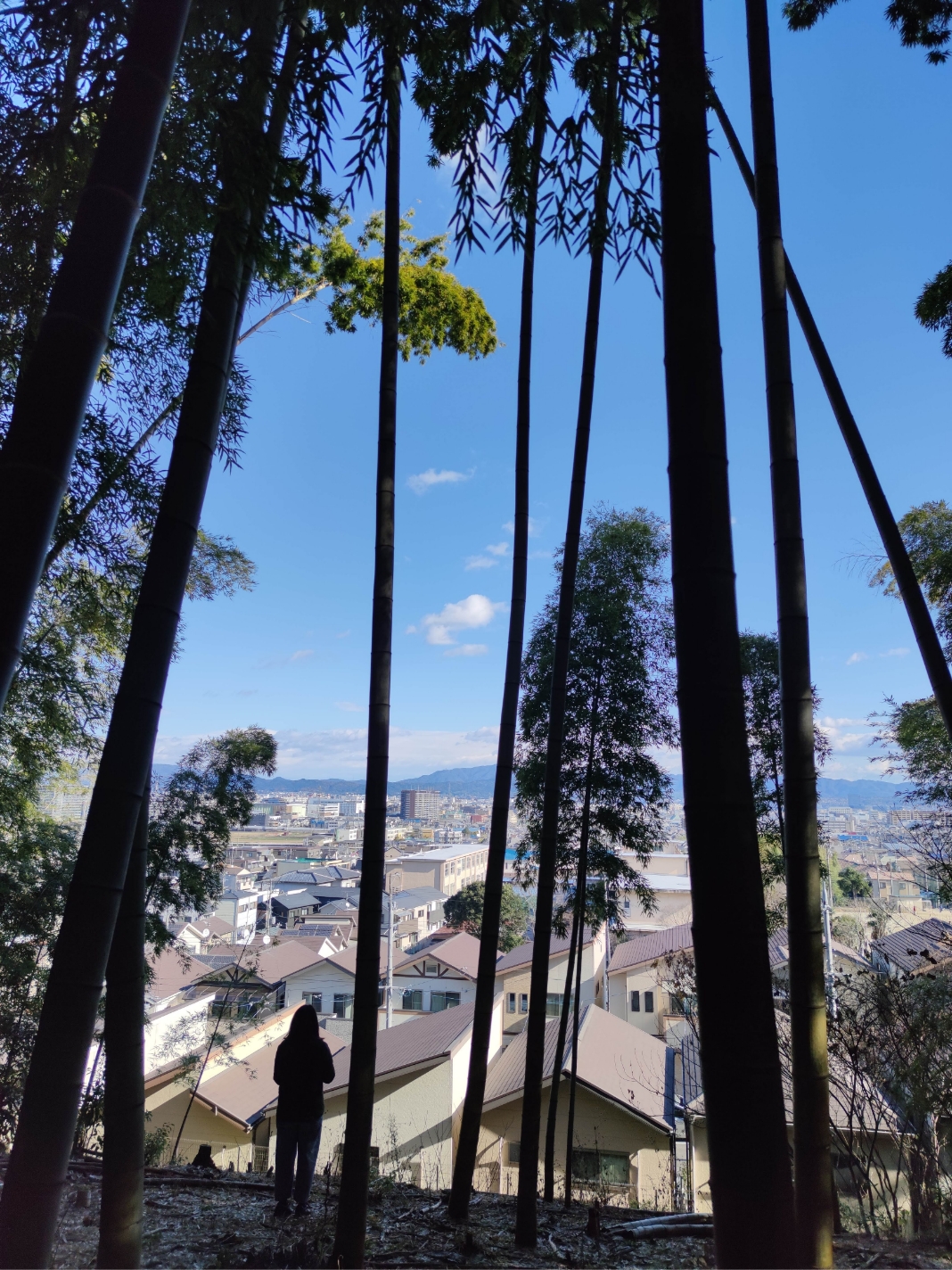
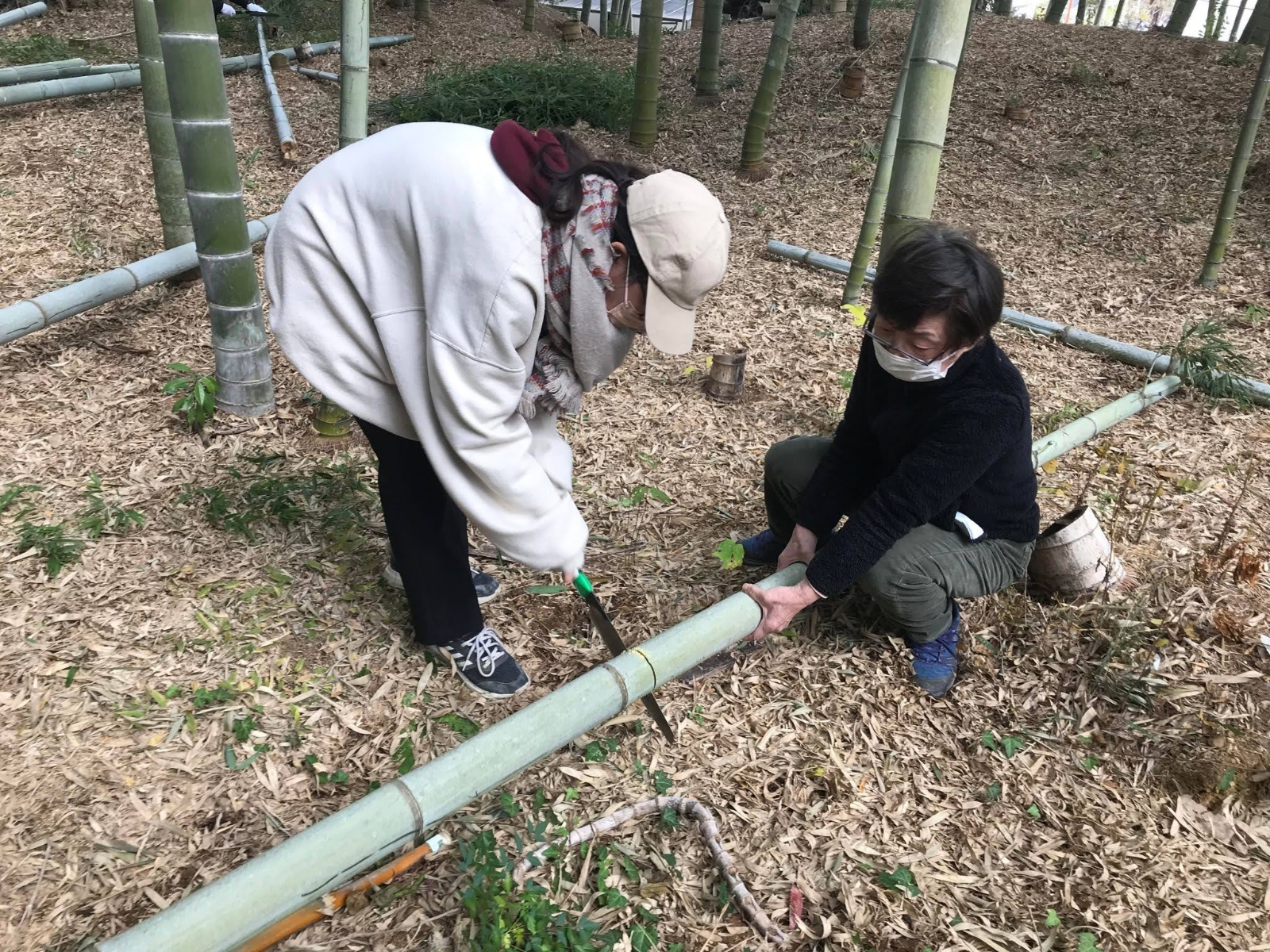
「学生×地域つながる未来プロジェクト」の中では、京都府向日市の「藪の傍」という地域活動団体と協働する学生チームの一員でした。藪の傍は放置された竹林の活用に関して柔軟性をもって活動している団体です。私たち学生チームは彼らのインスタグラムを立ち上げて運営し、私は投稿のデザインを担当しました。
In this project, I was part of a team that worked with a community action group called Yabu no soba. Yabu no soba is an organisation that works flexibly to utilise abandoned bamboo forests.
Our student team set up and ran their Instagram and I designed the posts.
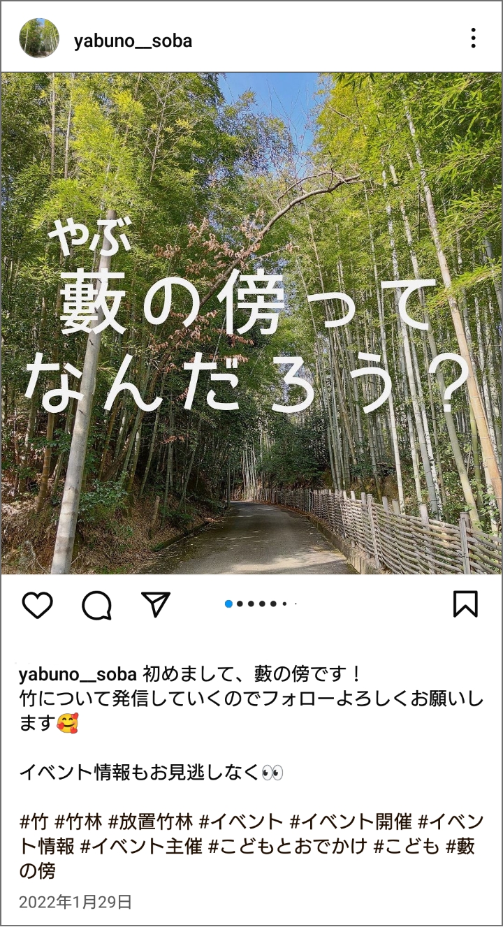
運営の狙い
この団体は高齢のSNSに馴染みのない人が多かったため、私たち学生チームは日頃SNSに慣れ親しんでいることを活かしてインスタグラムで同年代に向けて情報発信し、放置竹林の問題を大学生などの若い層にも知ってもらうことを目指しました。
Aim of the Management
As the organisation was mostly made up of elderly people, we aimed to make the issue of abandoned bamboo forests accessible to a new, younger audience, such as university students.
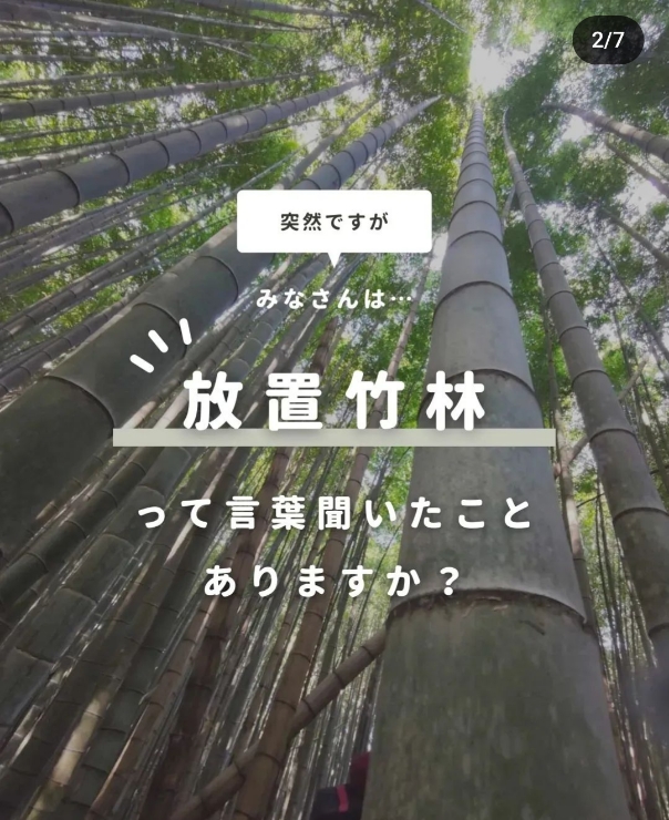
デザインのポイント
インスタグラムで若い世代に人気の情報発信アカウントの投稿を調査し、ターゲットである大学生に見てもらえるようトレンドを取り入れたデザインにしました。また、「放置竹林」という一見なじみのない問題をわかりやすく説明することを目指しました。
Key Design Points
I researched posts on Instagram from information-dissemination accounts popular with university students and the younger generation to ensure that the design was trendy. I also designed the posts to make the seemingly unfamiliar issue of abandoned bamboo forests easily known.
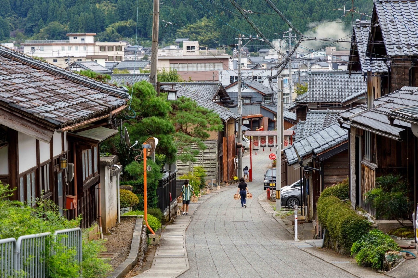
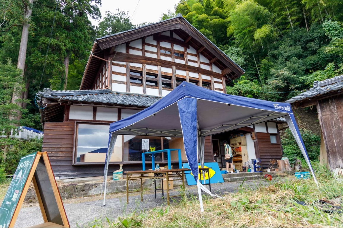
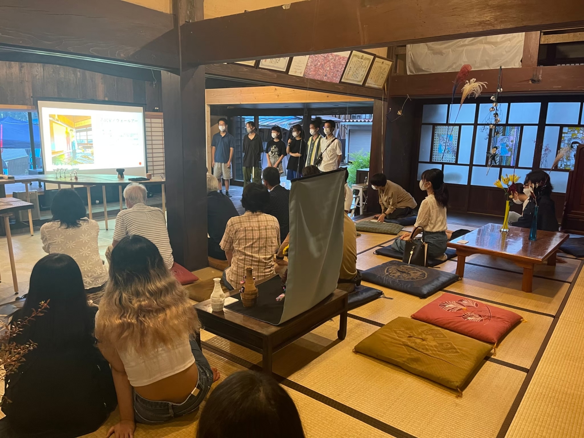
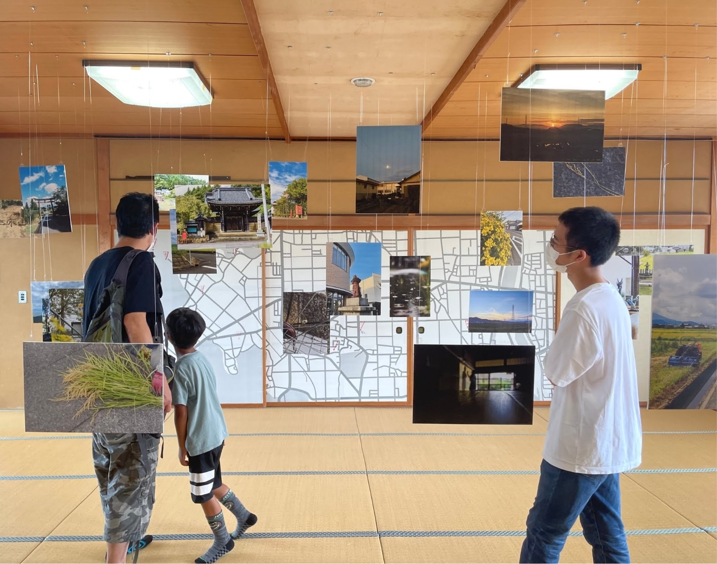
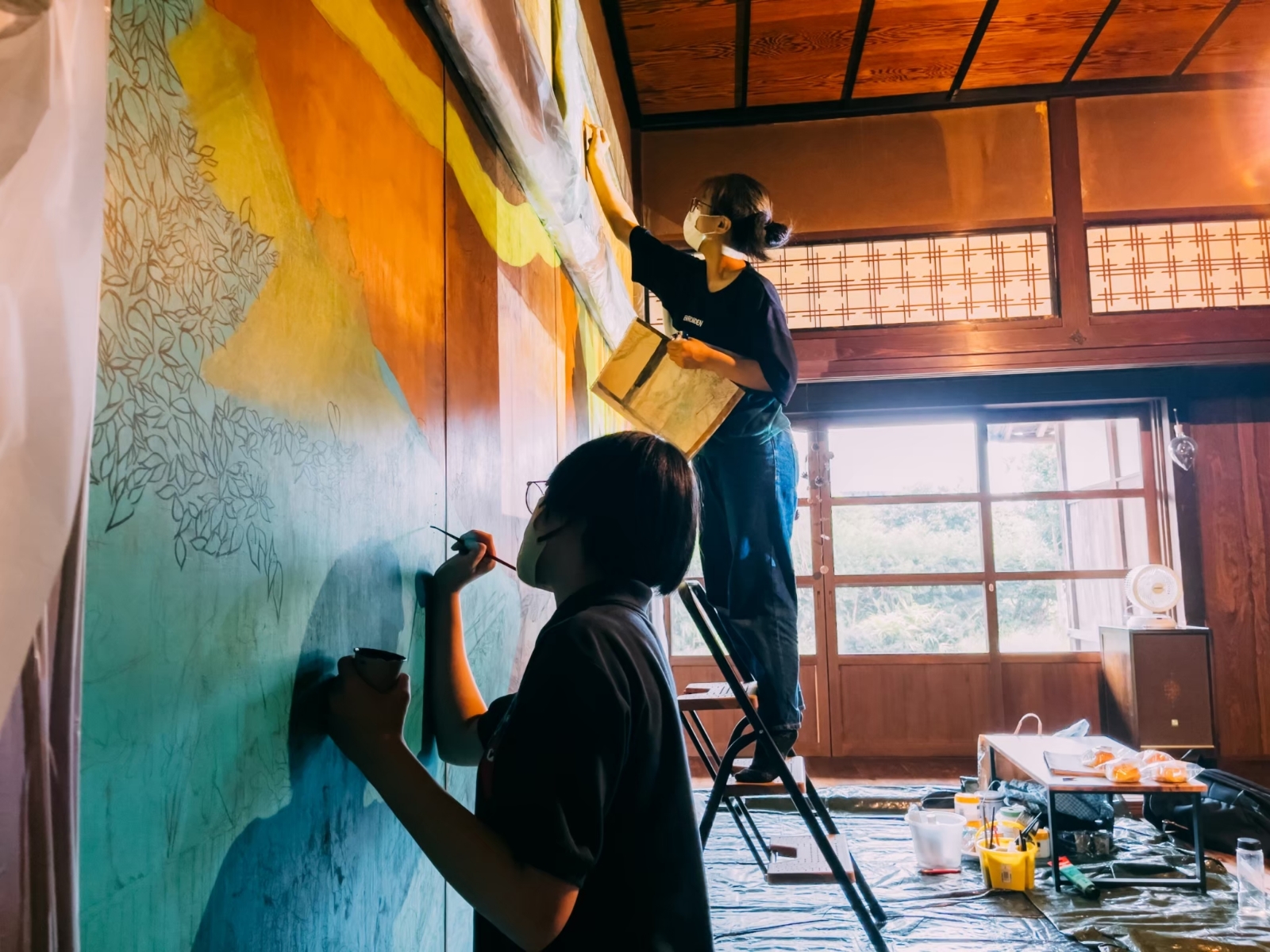
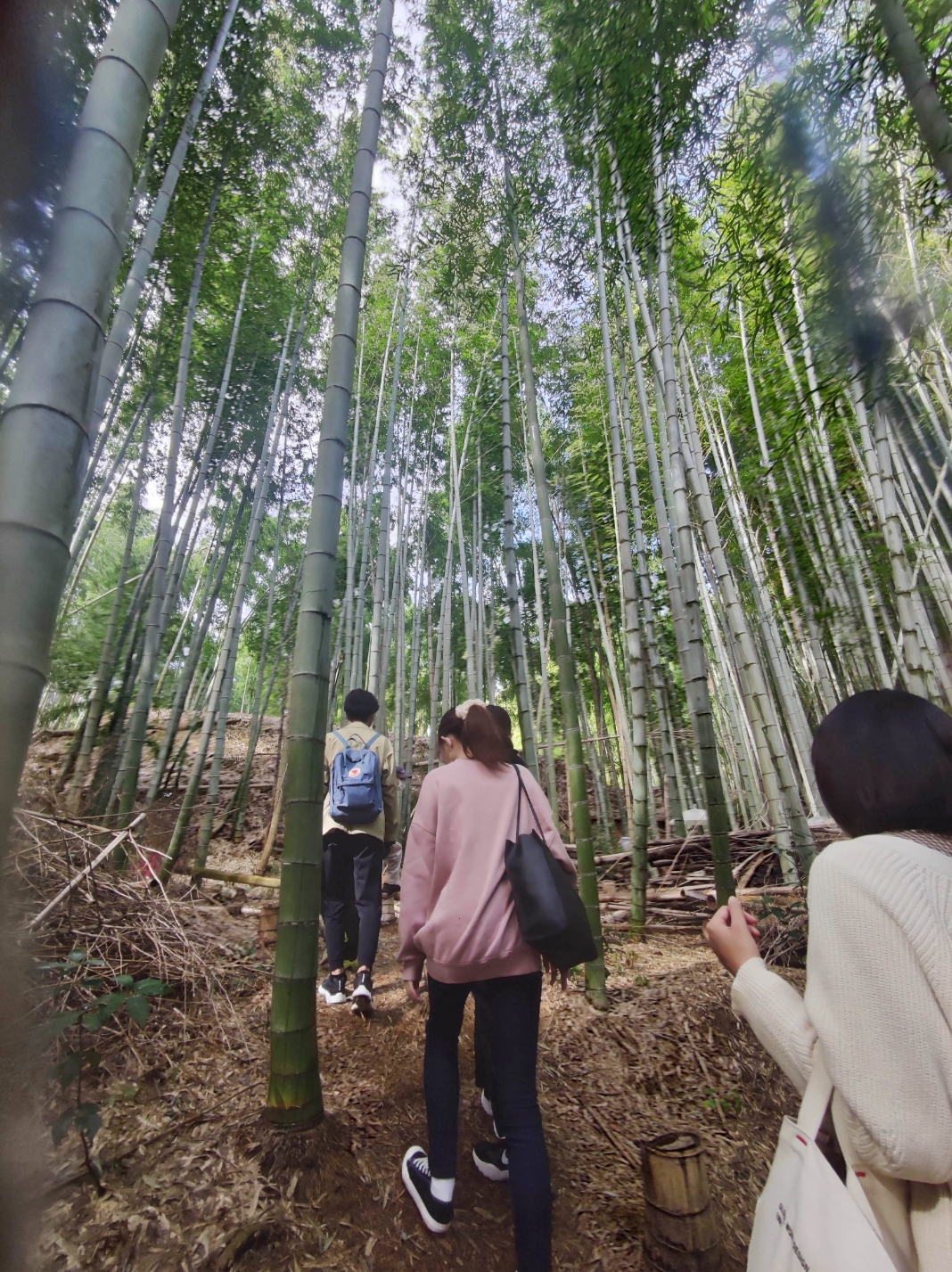
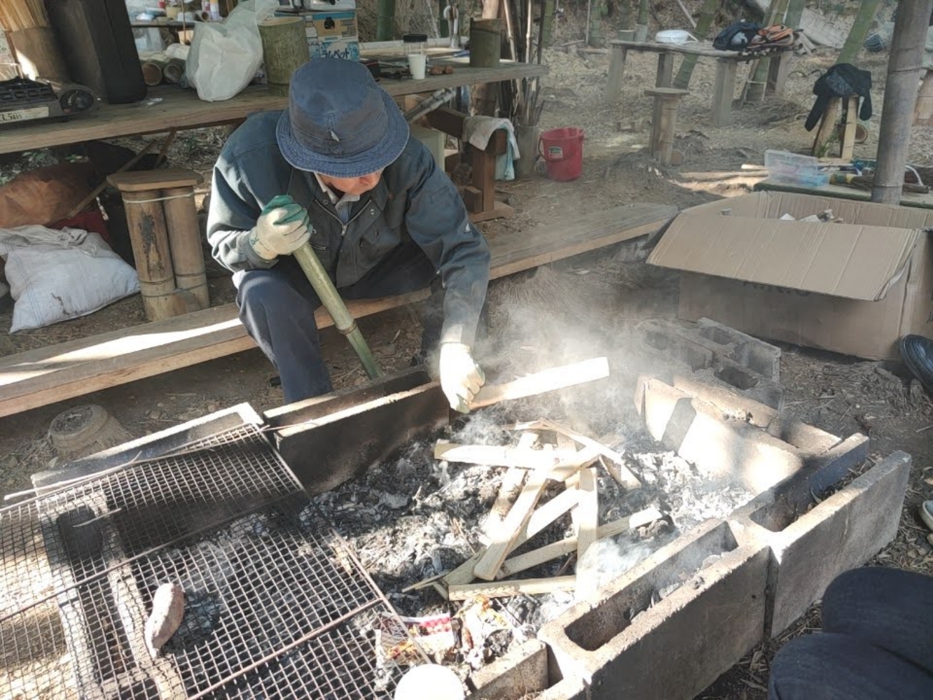
プロジェクトの様子
Photos of the project

令和3年度 河和田アートキャンプ
Kawada Art Camp
2022
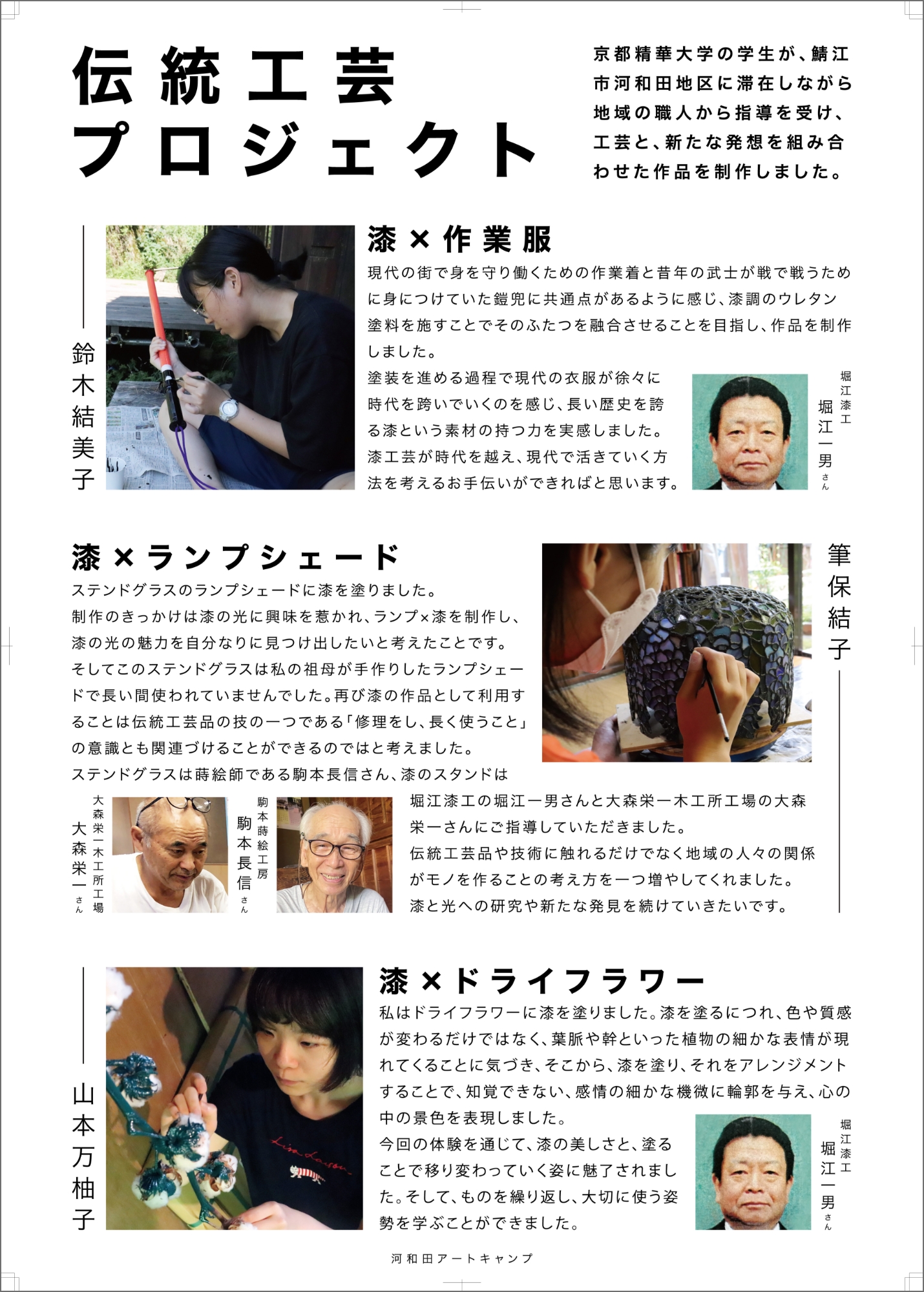
2022年7月から9月にかけて、福井県鯖江市河和田町に京都の大学生が滞在し、地元の伝統工芸士の指導のもと、工芸と新たな発想を融合させた作品を制作する「河和田アートキャンプ」に参加しました。
このプロジェクトで開催した展覧会「Sabae Cross Art」の作品紹介パネルや作品キャプションのデザインを担当しました。
From July to September 2022, I participated in a residency in Sabae, Fukui Prefecture, where university students from Kyoto, under the guidance of local traditional craftspeople, combined craft and new ideas to create artworks.
I designed artwork labels and panels introducing the works and artists for the exhibition ‘Sabae Cross Art’, which was held at the end of the residency.
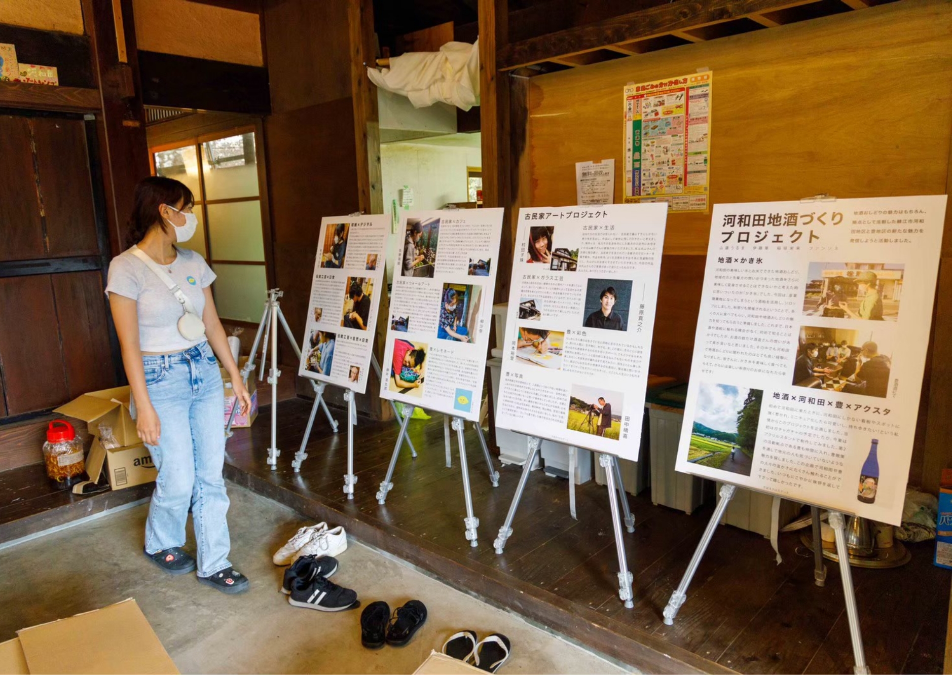
プロジェクトの様子
Photos of the project